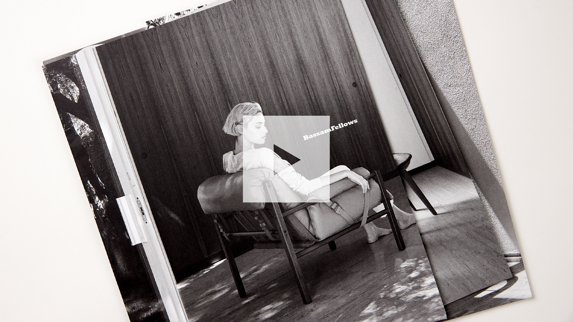
Of all the benefits that print offers in our digital world, one of the most often overlooked is “freedom.” Not only can you peruse it anywhere, but its contents are easily clipped and put on a wall, in a notebook, or wherever it is you keep your creative inspiration. It was this simple fact that inspired luxury lifestyle brand BassamFellows to invest in a delightfully unconventional Fall 2020 print catalog of its furniture at an equally unconventional moment in history.
Duotones: Selling the Film Noir Fantasy
A luxury lifestyle brand that blends the timelessness of modern classic looks with the warmth, solidity and texture of the natural world, BassamFellows wanted to convey all of this in its new print catalog. While the coronavirus pandemic was forcing every company to reconsider investments of this kind, the brand recognized just how powerful such a piece could be arriving at a time when direct mail had slowed to a trickle, and recipients were starved for anything of real substance to hold.


Aiming for the rich, mysterious tone of film noir and vintage silver gelatin photo prints, designer Boris Bencic collaborated with photographer Deborah Jaffe and print consultancy Tocci Made to craft this moody Black and White aesthetic.
First, Deborah photographed nearly everything with an iPhone under Boris’ art direction for a grainy, high-contrast look. Next, Tocci Made worked closely with printer Brodock Press to offset print them on 100 lb. Mohawk Superfine Ultrawhite Eggshell as duotones – Black + PMS 426 Gray – to expand the tonal range of those images.


This, combined with the sheer size of the pages themselves – 20 X 12.25 inches folded down to 10 x 12.25 inches – shows off everything from the grain of the wood in a chair seat to the texture of a background wall.


So rich are these images, in fact, it seemed a shame to permanently imprison them in a traditional bound catalog.


Loose Leaf Binding: Freeing Your Vision
Knowing that BassamFellows’ target audience of architects and interior designers tend to create mood boards for their projects, they avoided bindings of any kind in favor of a loose leaf approach in which the signatures were folded down and nested one inside another. (This was actually inspired by the loose-leaf photography portfolios of my good friend David Prince.)


And to create the illusion of a real brochure spine, they scored the outer cover.


So rich and luxurious are these prints, in fact, they wouldn’t be out of place framed on a wall. And when it comes to ensuring your catalog remains top of mind for weeks and months to come, you can’t ask for better than that.
While the perfect binding for this piece turned out to be none at all, in most cases your project will cry out for binding of some kind. Be sure to explore a wide variety of options – including specs and pricing information – in our free Binding Cheat Sheet. Download yours right now!


