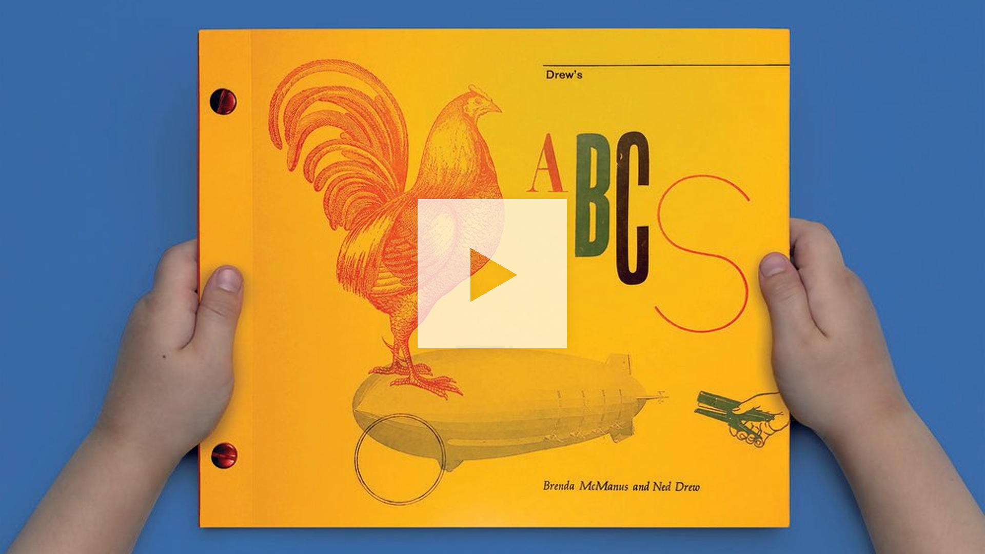
Whenever life gets you down, just remember that somewhere out there a little boy is learning how to read. Using the most impressive ABC book you’ve ever seen. Letterpress printed and hand-bound. By his parents. Who are design professors. Using their own personal collection of type, woodblocks and line-engraved images. (It gets better and better with every detail :))
Not simply a work of art, “Drew’s ABCs” is a fascinating exploration of print and education and how the two can best serve one another. Designed by Brenda McManus and Ned Drew, this 68-page book is excitingly irreverent in its use of typography, color and illustration.
(The book can be purchased here.)

Letterpress printed on White 70 lb. Text Silk Coated Mohawk Loop, each spread presents one letter of the alphabet. That letter is repeated multiple times in a different size and typeface alongside line-engraved and woodblock illustrations of things starting with that particular letter. Entire words are also included to help readers practice their pronunciation — “P” features “Plane,” “Point,” “Peacock,” “Pizza” and so on. (The book’s vivid yellow cover is 80 lb. Cover Mohawk Carnival Vellum; the endsheets 60 lb. Text Mohawk BriteHue Vellum Red.)


Also impressive are the book’s use of folds, which make it feel as substantial as it looks: the interior pages consist of French folds while the cover, too, is folded in. And to underscore the delightful imperfections of letterpress in a maddeningly perfect digital world, the belly band proudly advises you simply: “Don’t mind the imperfections…”


The book’s approach was directly inspired by their son’s curiosity and questions, Brenda explains. These “challenged us to explore various learning processes as well as the role design could play in aiding that development and growth.”
The book’s creators were also inspired by three of their design heroes, Brenda reveals: Bradbury Thompson, Piet Zwart and Lester Beall. One glance at the work of each after exploring “Drew’s ABCs” will leave you exclaiming “Aha!”
A Font of Learning For Potential Type Nerds
Second only to their devotion to their son is the couple’s passion for movable type, including its rich history and the way it influences the creativity of the people who work in the medium. Seeing a learning opportunity in the making, the couple enlisted the help of students from Pace University-NYC and Rutgers-Newark, where Brenda and Ned teach, respectively. They proceeded to give their students a series of crash-course workshops in everything from typesetting to color management.
“We assumed most would run away once they got a sense of the reality of their commitment,” Brenda admits. “However, to our pleasant surprise, all became completely enamored with the project to the point where we had to ask them to scale back their commitment because we had too many helpers.”
Over the next 9 months, the students gradually brought “Drew’s ABCs” to life. Says Brenda, “There was always one of us on press with the students to oversee and ensure everything was on track. We were both aware that opening our collaboration to students would only be successful if the quality of work did not suffer.” It didn’t.


At a time when so many seasoned designers, printers and teachers are wringing their hands over a lack of print-process understanding among designers new to the workforce, it’s heartening to know that at least some students are still learning the ABCs of printing the old-fashioned way.
The use of Chicago Screw binding was a brilliant choice here. Find out about all your binding options: Download our free, newly expanded “Binding Cheat Sheet” right now!


