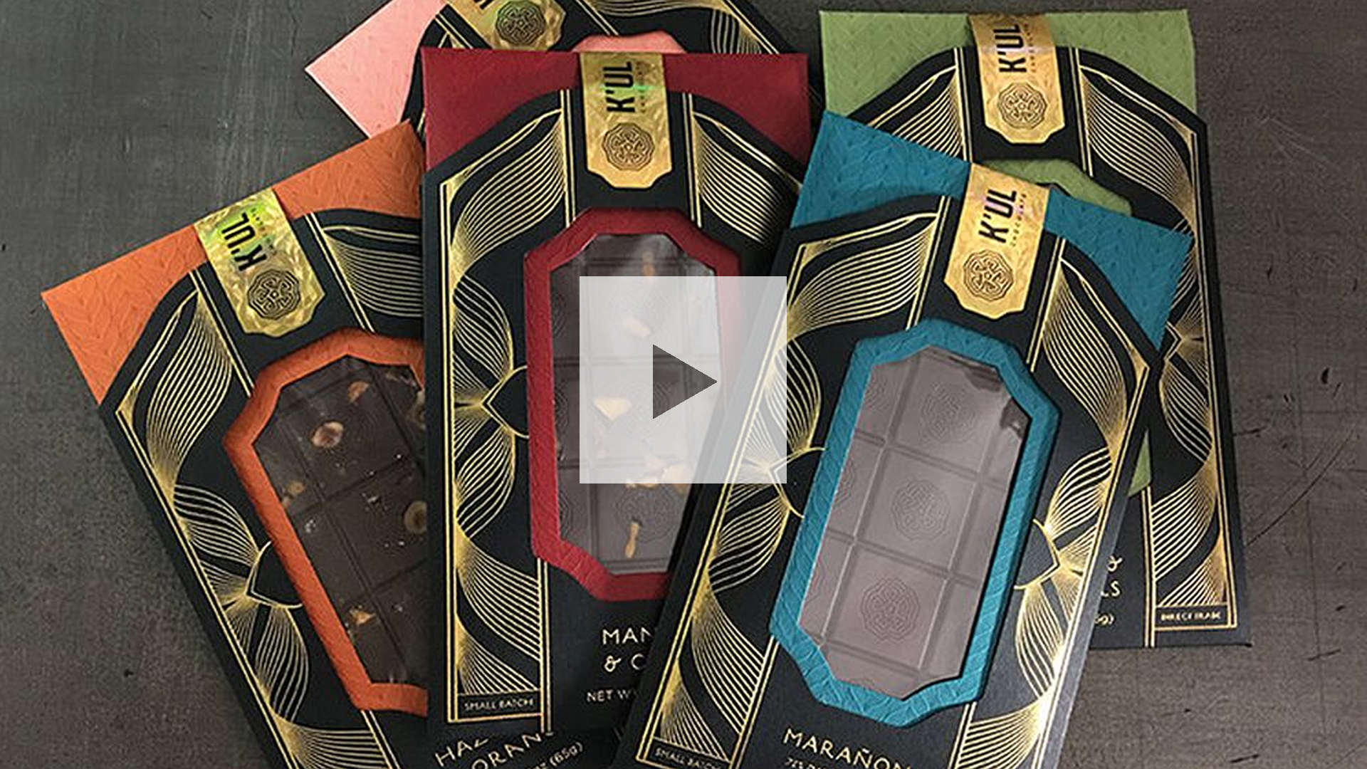
When you think of chocolate the words “guilty pleasure” and “diet-busting” might come to mind. This is all about to change. When K’ul Chocolate (pronounced “cool”) opened its doors in 2015 their goal was to completely reinvent the way people saw chocolate – in this case as a source of energy for physically active people.
Two years later the confectioner enlisted letterpress masters Studio On Fire to develop creative packaging for a range of its chocolates that would appeal to women, albeit subtly.
What Makes This Creative Packaging?
What they came up with is completely counterintuitive – creative packaging with several very flamboyant details that nevertheless feels less than the sum of its parts when they all come together…and that’s a good thing.


The Studio on Fire team started with a colorful inner sleeve of 80 lb. Leader Basis Cover, with each bar flavor assigned its own unique color: Dark Red, Olive, Coral, Teal and Dark Orange. The same pattern was applied to each via tonal letterpress printing [Read PRO Tip] for a lovely haptic touch. “The pattern has a comforting sweater feeling,” explains Studio On Fire’s Sam Michaels, “but the ink is still just dark enough for the brand story to be readable.”


A custom die-cut window at its center grants an enticing peek at the bar inside.

Thus wrapped, the bar is then slipped inside an 80 lb. Epic Black Neenah Classic Crest sleeve with an Eggshell finish, [Get Swatchbook] featuring a matching, though somewhat larger, die-cut window, producing a gorgeous colorful “frame” for the chocolate inside. On the back, the flavor and confection details are imprinted in Gold foil, while more luscious foil was applied to the front in wavy patterns that both complement the letterpress impression on the colored sleeve inside and bring to mind the pouring of melted chocolate.


“Trying to achieve a feminine feeling could have gone real cheesy real fast,” Sam admits, “but the way we were able to convey a softer motif through sweeping curves and specific paper colors feels like a real victory.”
The finishing touch? A Gold NanoEmbossed foil seal [Read PRO Tip] featuring the K’ul Chocolate name and logo not only holds the two sleeves together, but also seals the chocolate inside.


Breaking the seal and sliding out the inner sleeve feels like a special occasion, which is perfect as this chocolate is meant for gift giving.


“We had a very educated client who was wonderful about sharing his merchandising experience with us through the process,” Sam explains. “The decisions he made on weight of bar, shape of bar, flavors, etc., were all very thoughtful, so it was exciting to make an equally thoughtful package.”
Starting to dream about all the creative possibilities when it come to foil? It’s not just for clients with big budgets anymore – there are a number of modern foiling techniques that are just perfect for small print runs and limited means. Save yourself a lot of time (and potential mistakes): Download our free Foil Cheat Sheet right now!


