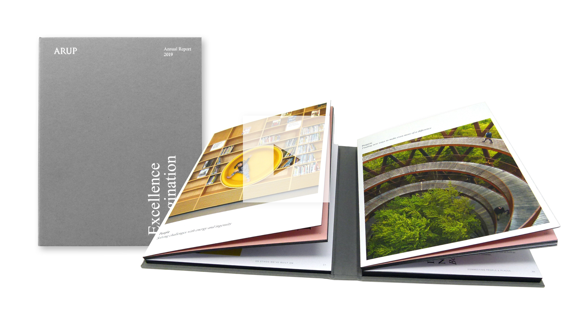
When you think “annual report” you probably don’t think “wow,” which is a shame. After all, what better place to show off a company’s innovative culture than in a document designed to not only keep current investors excited, but also to attract new ones? Playing off the “stuffy report” cliché, Arup’s 2019 annual report design looks, at first glance, like an old hardcover tome snatched from a dusty bookshelf. Only when it is opened is something truly unexpected revealed inside.


Arup: A Melding of People & Design
Founded in London in 1946, Arup has grown into a global firm of designers, architects, engineers and more, building everything from stadiums and hospitals to high-speed rail networks and even an acoustic reverb chamber for Bjork’s “Cornucopia” tour. While all of these are tremendous feats of design and engineering, they also involved a number of people in their creation, and affected many more in return.
Just a Normal-Looking Book
To capture both of those aspects of Arup’s business – people and design – studio OPX and printer Kingsbury Press [projects / website] employed an impressive engineering technique of their own.
To ensure the greatest impact, they kept it under wraps by starting with an unassuming cover of 135 gm (90 lb.) Colorplan Smoke with a Sandgrain emboss finish wrapped around book boards, with the company name, “Annual Report 2019” and the watchwords “Excellence, Imagination, Purpose” all rendered in White foil on the front. They also added edge-painting on all three sides of the inside pages using Kingsbury’s proprietary KolorEdge process, all to make the annual report resemble a normal hardcover book from the outside. However, finally opening this volume reveals….


Two Books in One!
That’s right – there are not one but two book blocks inside, each separately bound using the printer’s K-Bind technique for creating lay-flat books. Each of these was then hand-glued – one to the inside front cover, the other to the inside back – a double Swiss bind, if you will.


Coming in at 50 pages, the left block focuses on the people involved in Arup, while the 82-pager on the right examines the projects themselves. Both feature luscious CMYK offset printed photographs, many taking advantage of K-Bind’s impressive ability to show-off full-spread images without losing a millimeter to the “gutter” found at the center of most other binding options.


Amazingly, when the Arup Annual Report is closed, it resembles a single standard volume. This is due in part to the precise engineering of the book blocks and spine allowance. The actual spine of each block was edge painted in black as well, matching the outside facing edges of the pages perfectly.
As you can imagine, a great deal of precision went into ensuring that both blocks sat neatly enough together to create the overall illusion of a single book. A fitting tribute indeed to a company known for bringing together the building blocks of stadiums, hospitals and Bjork stages around the world.
As you can see, the right binding technique doesn’t just keep your beautifully designed pages together, it can lend a whole new dimension to your work. There are numerous creative binding options available to you. Whatever you’re designing, be sure to download our free Binding Cheat Sheet right now to discover the pros and cons of each and every one of them.


